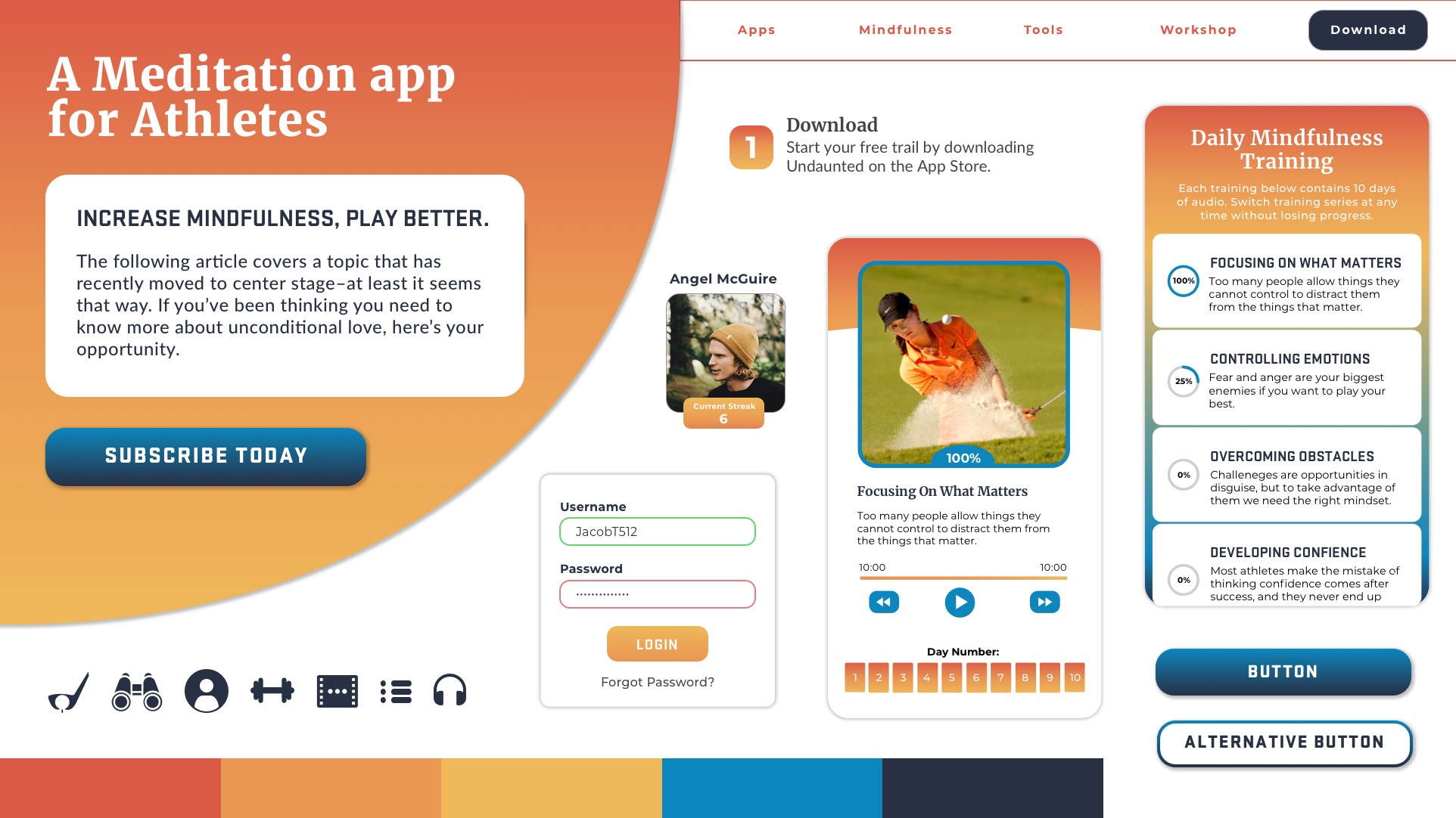
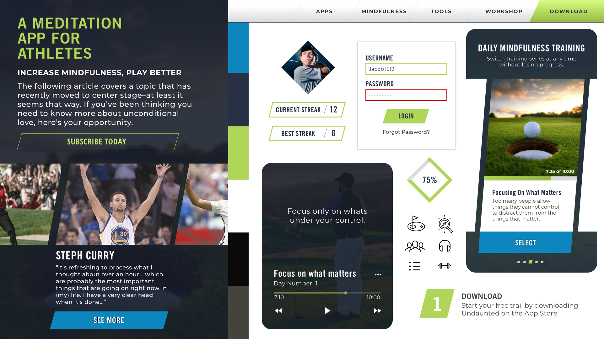
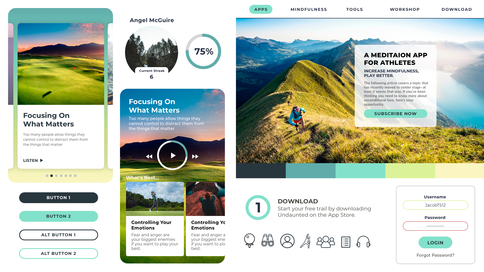
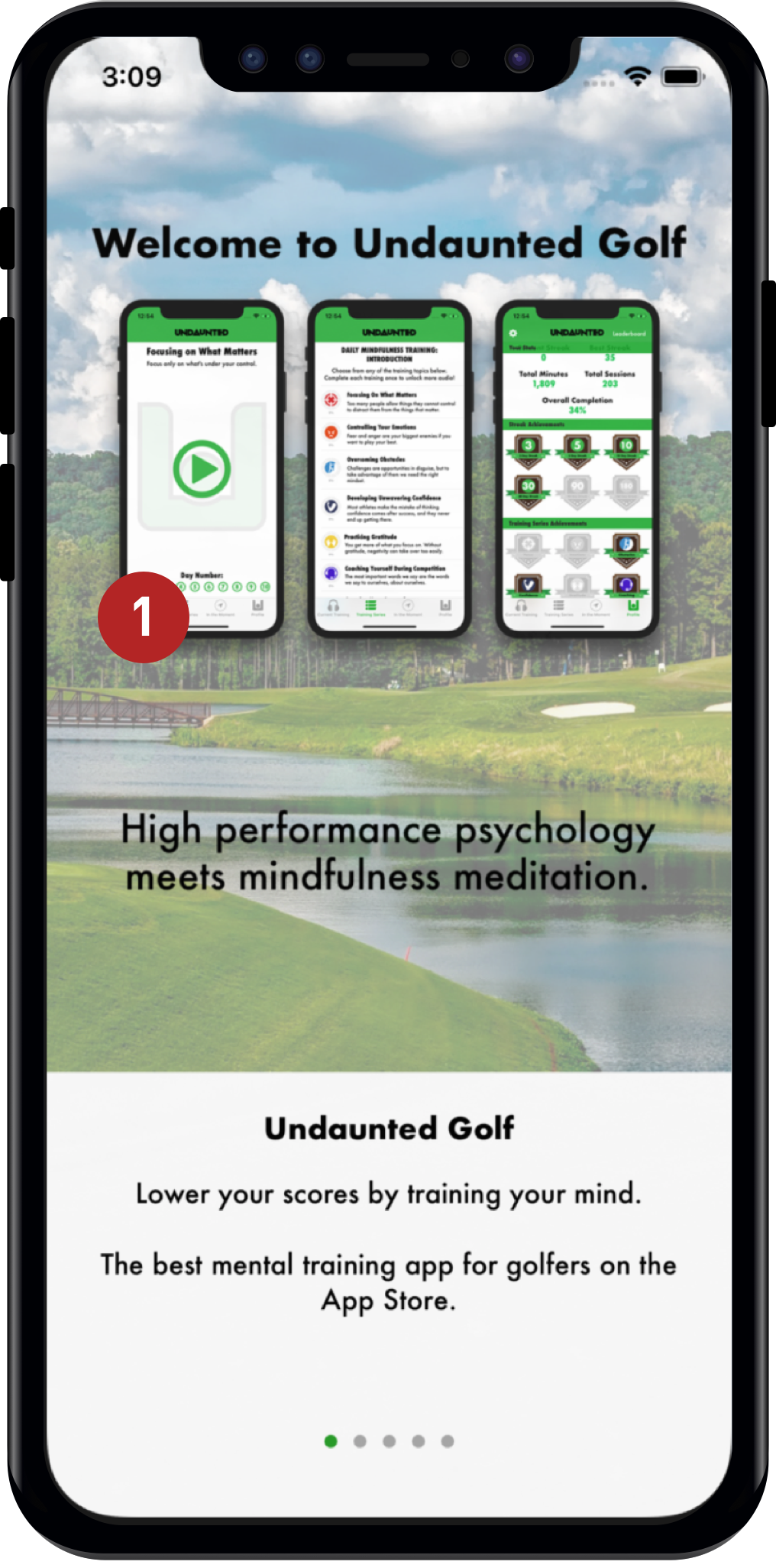
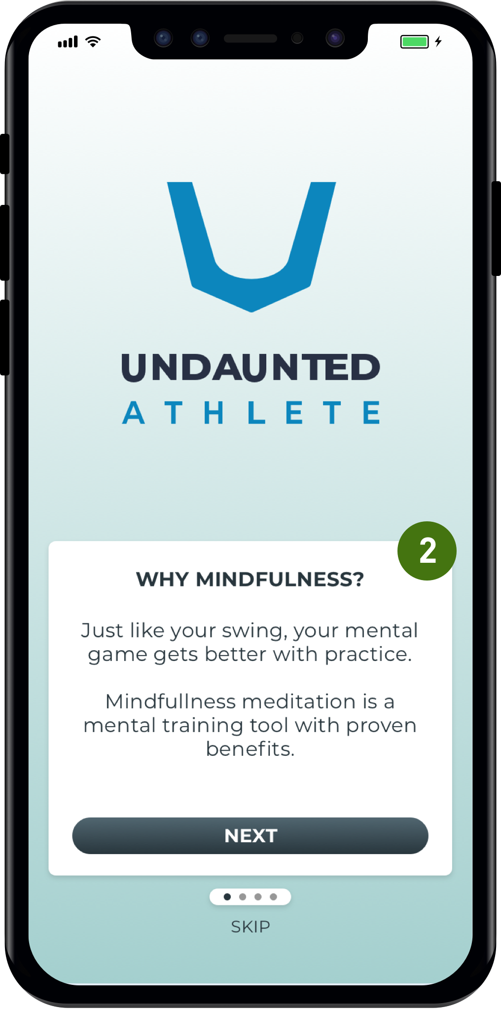
Undaunted Athlete

UI, UX & Web Design

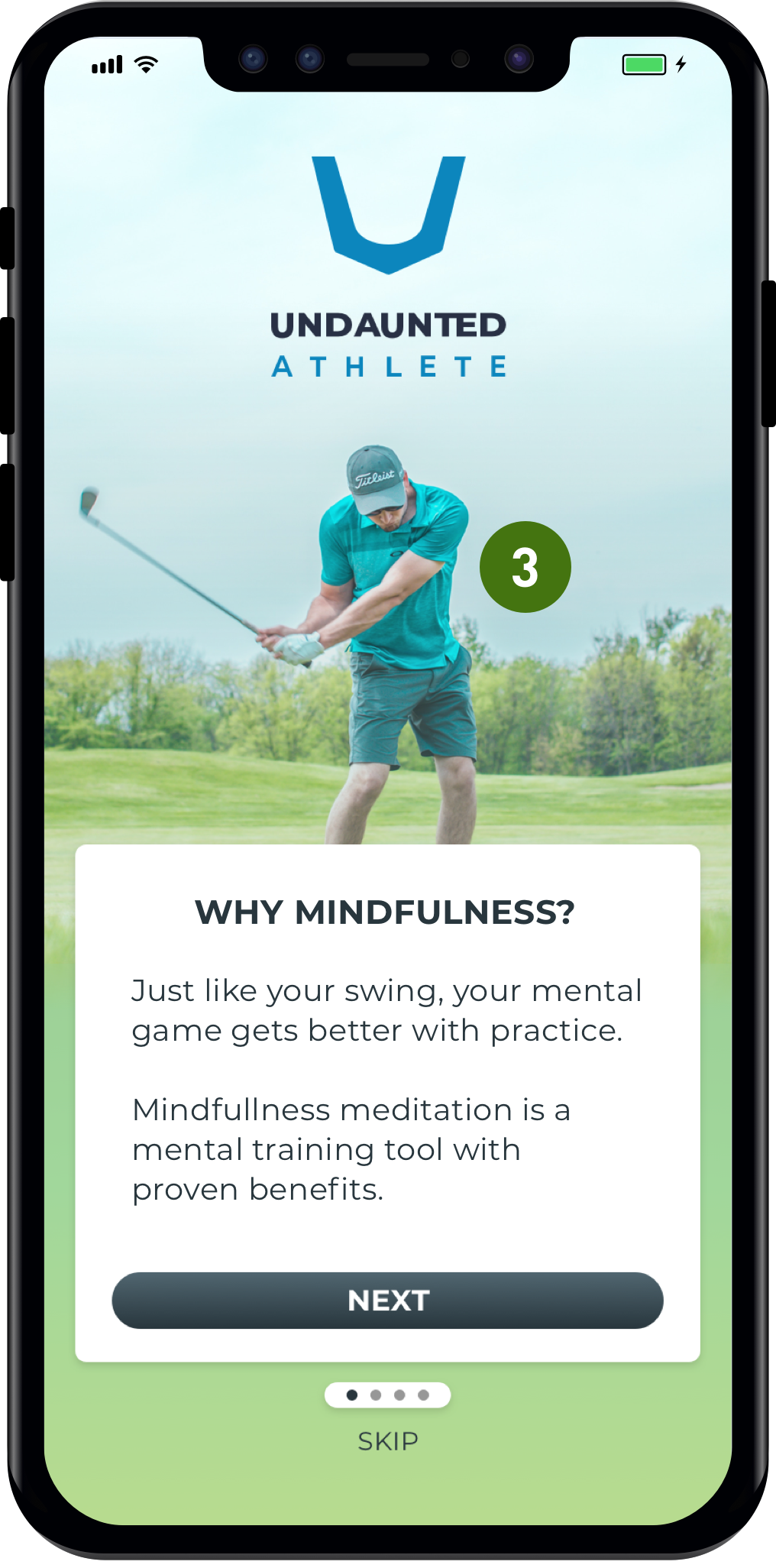
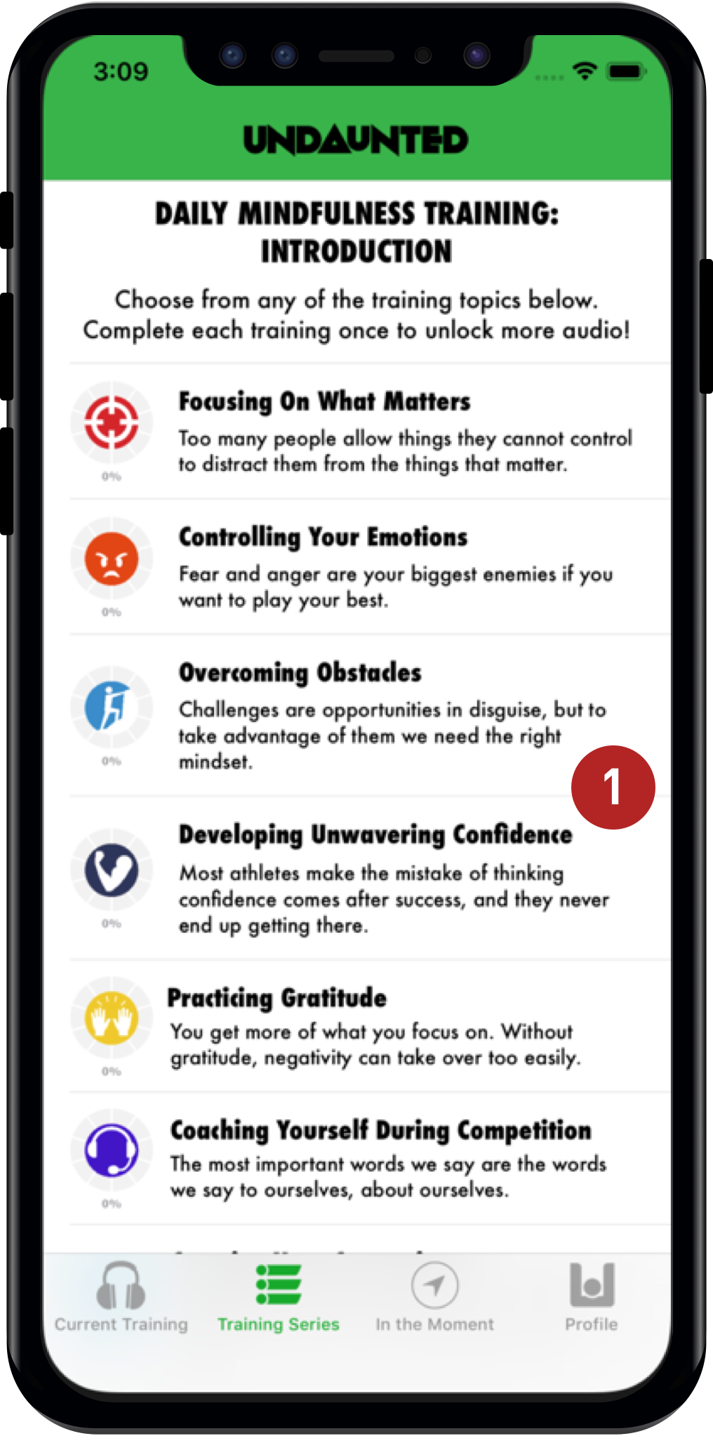
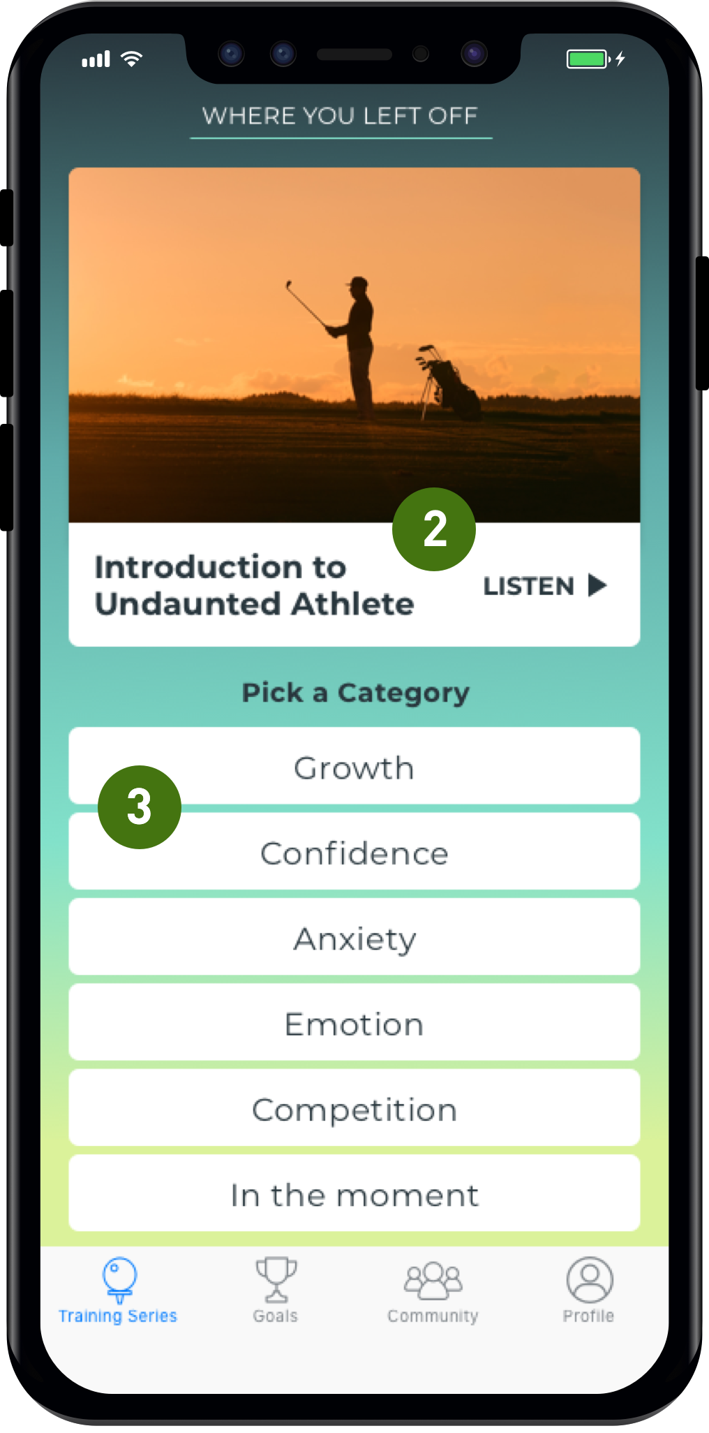
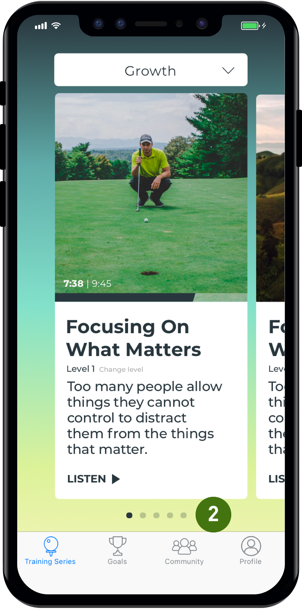
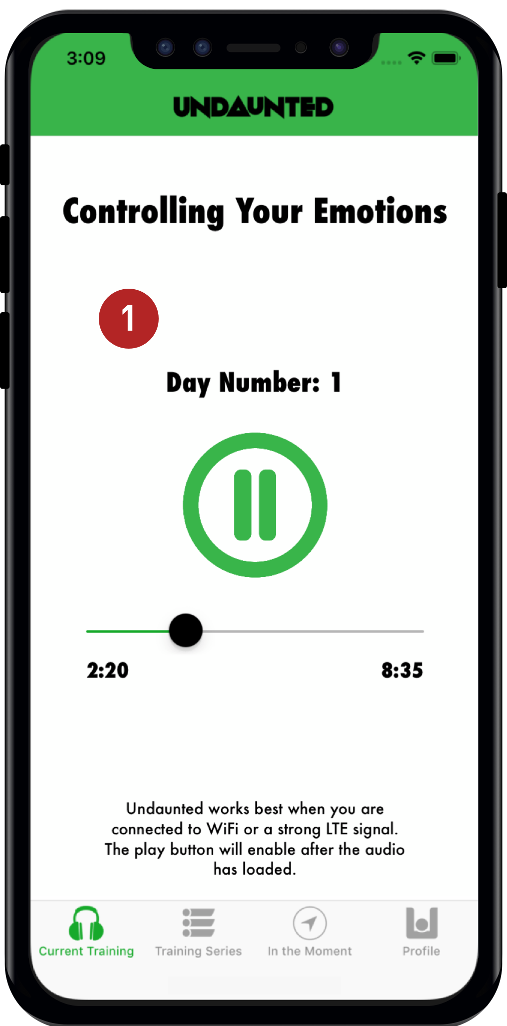
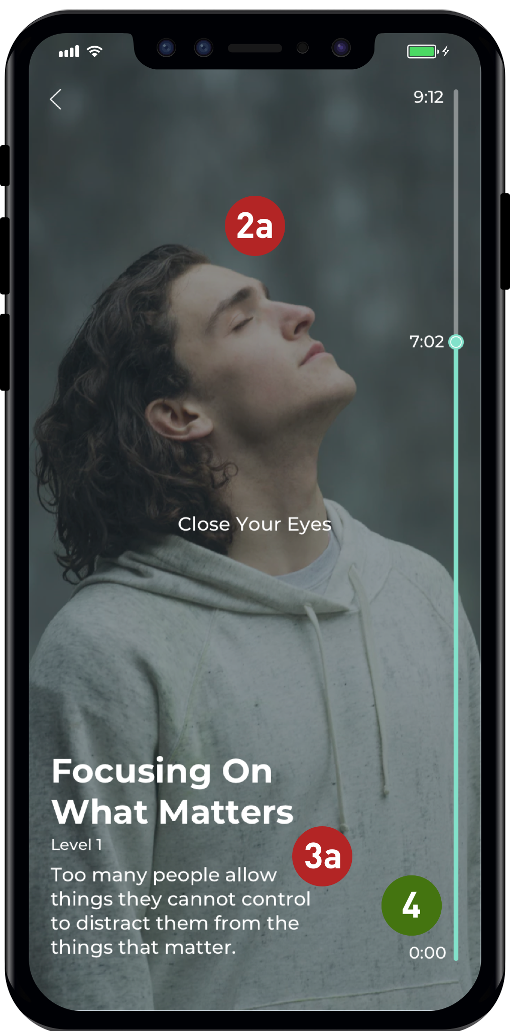
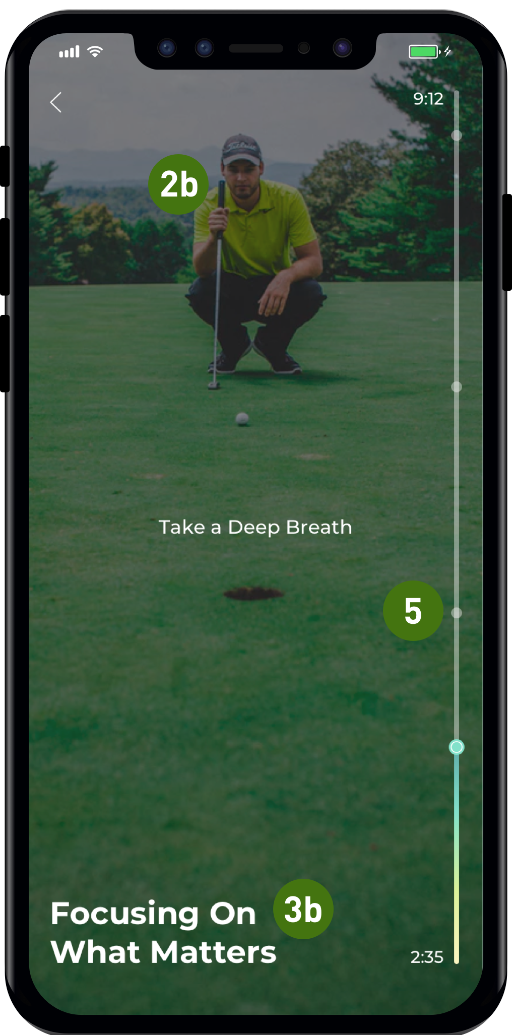
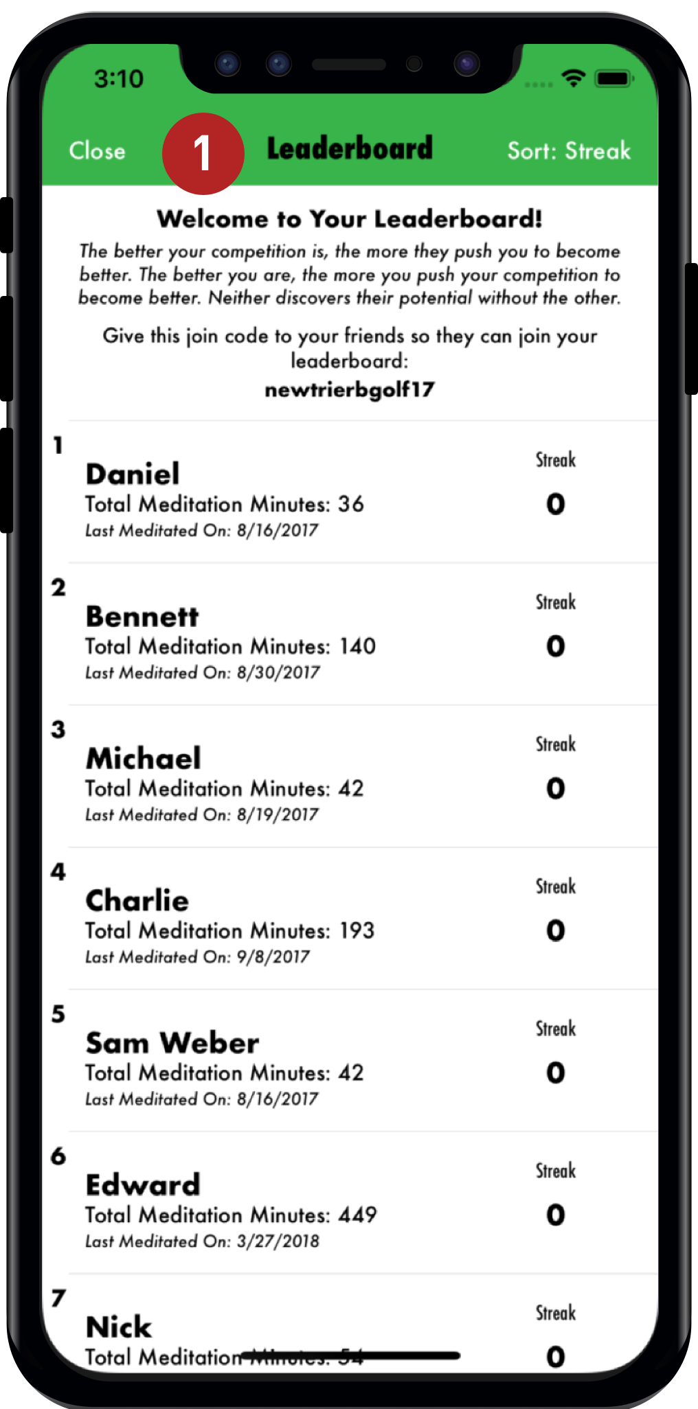
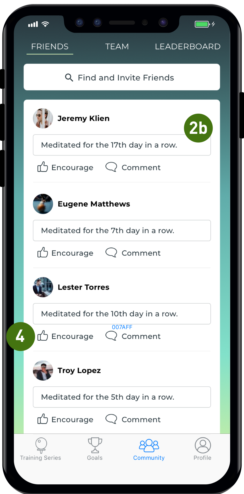
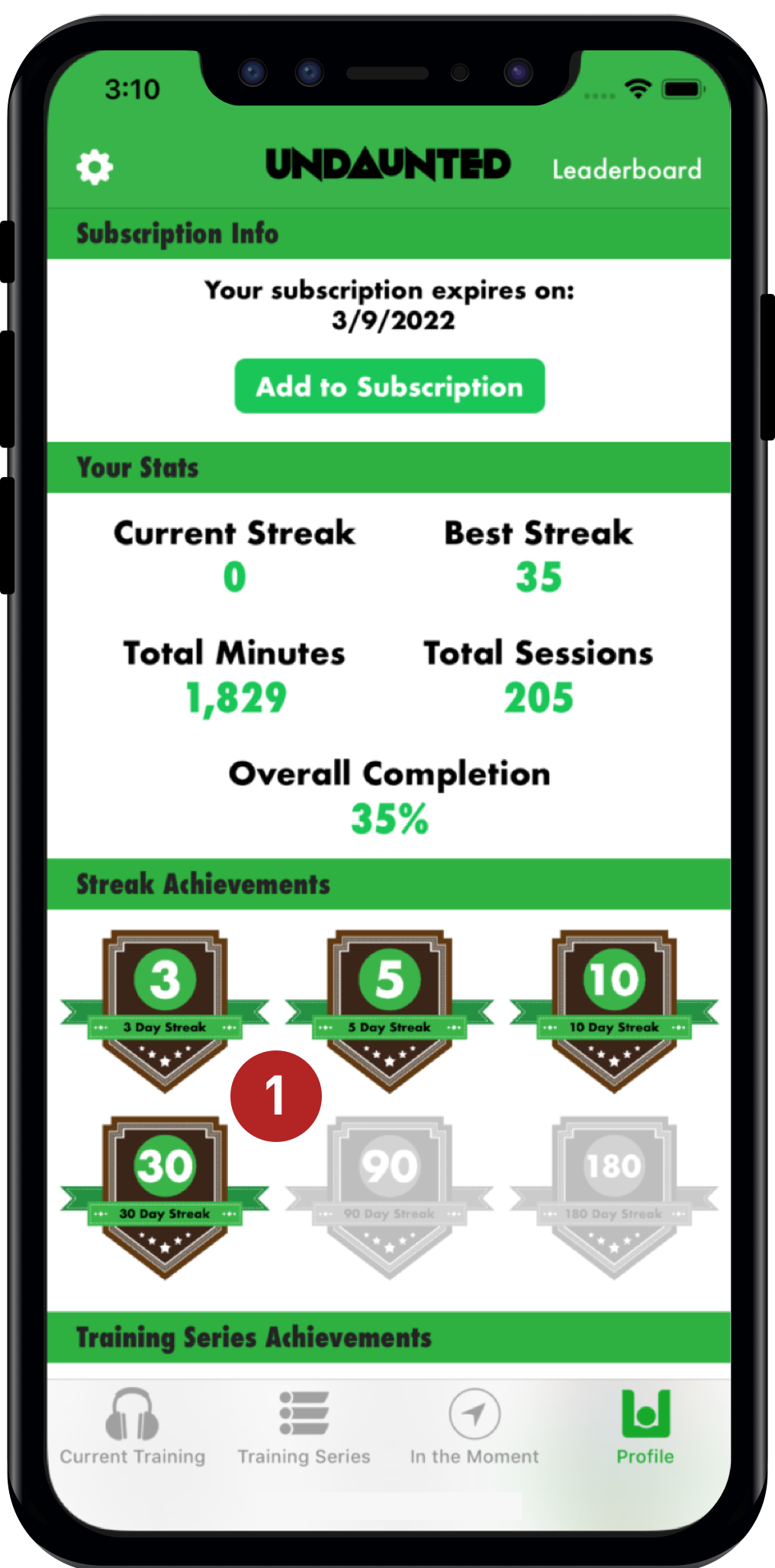
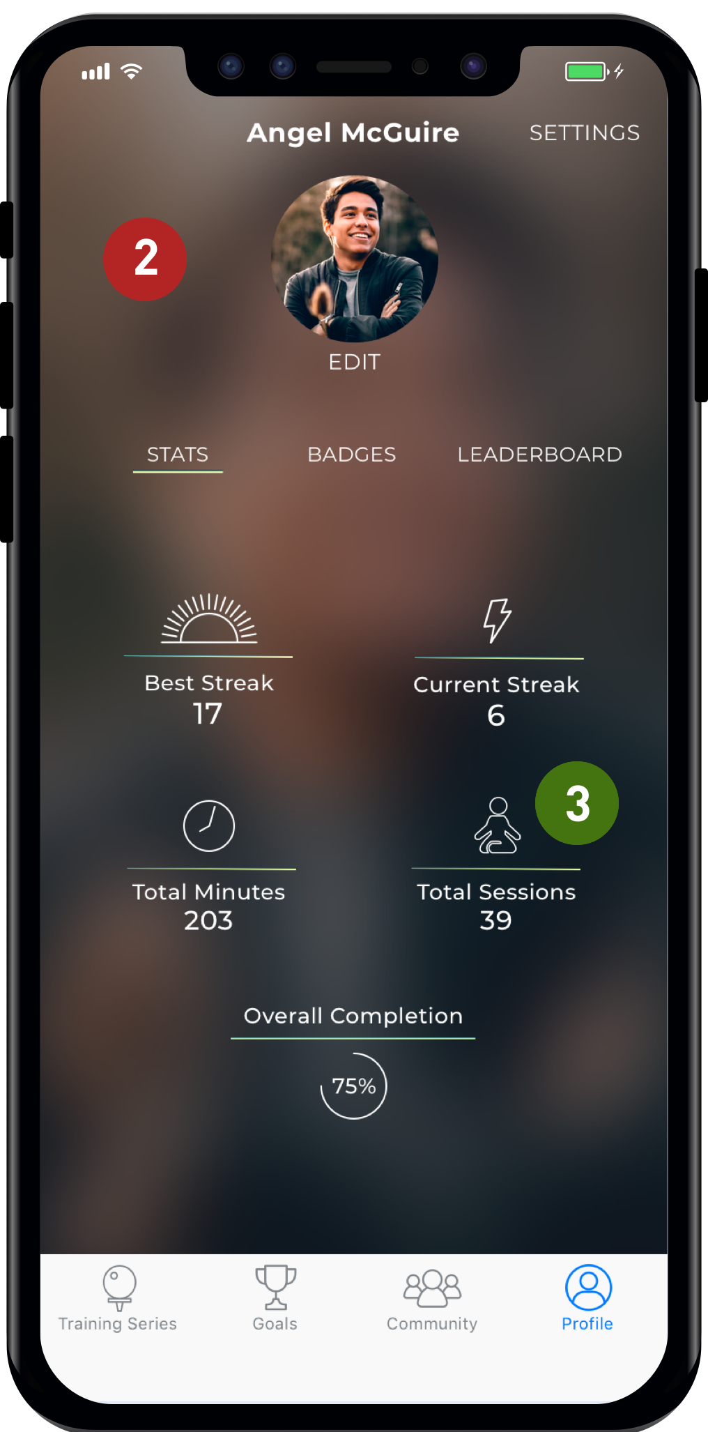
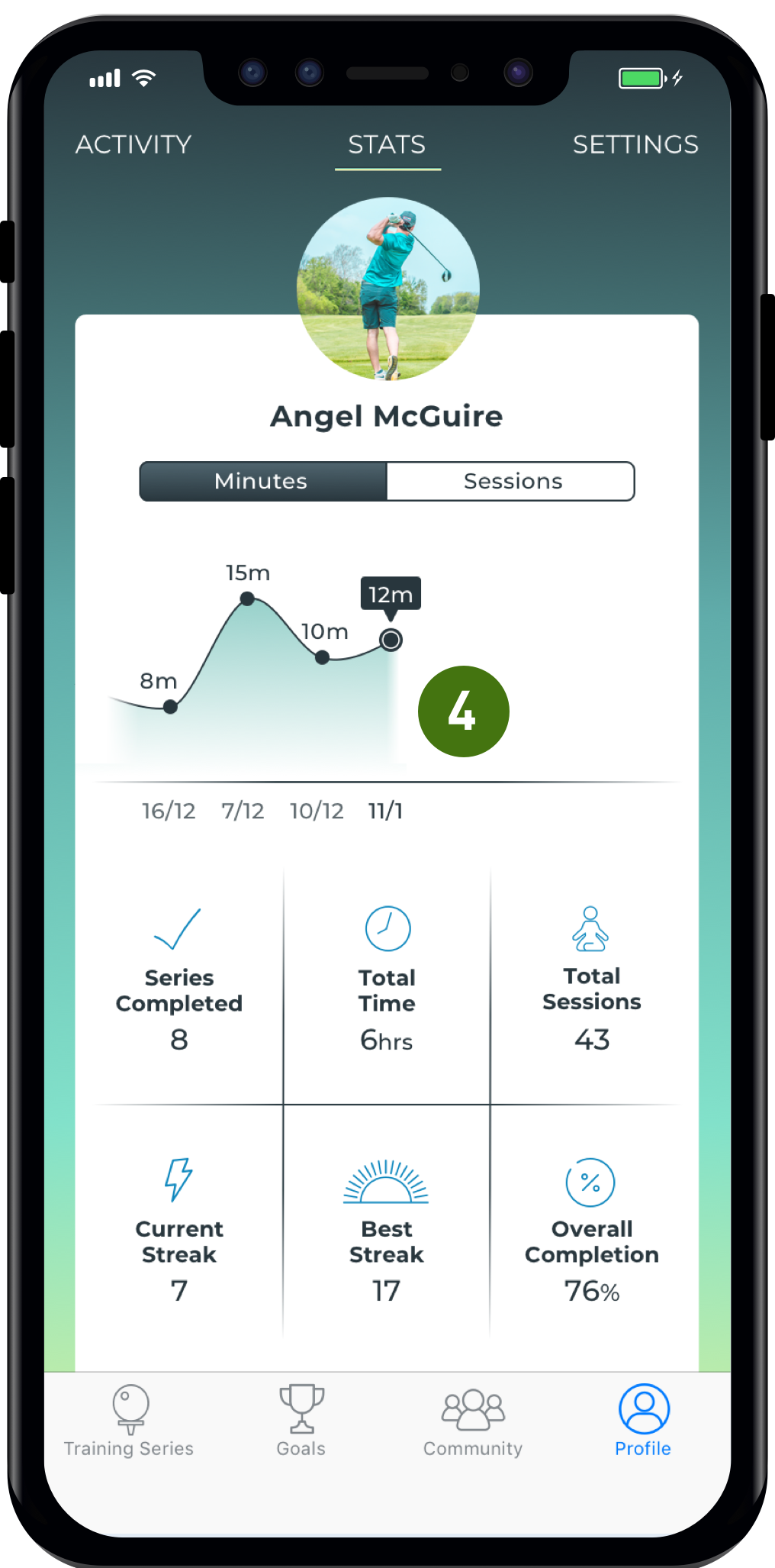
Undaunted Athlete's goal is to help athletes improve their game through mindful meditation. Lots of athlete work to improve their body, but don't realize how much of an impact the mind has. We collaborated together to give the application a visual overhaul and improve the overall experience for users.

Project Overview

Launched in 2016 by Eric Duffett, Undaunted Athlete wants to create more resilient, more confident and  selfless athletes. The mobile application focuses on mindful meditation to improve athletic performance. We focused on his flagship application used by avid golfers while designing with the expectation of branching off into other athletic pursuits soon.

I worked with the client to redesign the application while incorporating their recent rebrand. Based on client business goals, I styled the application to appeal to a new, younger audience while still designing with current users in mind. Users wanted a more personal experience, so we created and tested different on-boarding experiences that ultimately improved the overall application experience.

Goals

Redesign the Undaunted Athlete flagship application and create a more personalized user experience

Deliverables

Application redesign
New on-boarding experience
Marketing website to reflect new design
Brand style guide

Testers

5 avid golfer (32-56 years old)
6 golf coach (28-55 years old)
7 young golfers (14-19 years old)

//
Research

Target Audience

Looking through the data of the current landscape and what was projected for the future of the product felt daunting. I needed to break down their current and potential audiences to better understand the scope of the project. Since the target audience were often on a team, our client assumed golf coaches would be vital to the marketing side of the business I created three mini personas: the avid golfer, the golf coach, and the young golfer.

Young Golfer

Primary user

Golf Coach

Secondary user

Current user

Avid Golfer

Competitive Analysis

After we established the scope of the project and Eric’s preferred design style, we wanted to better understand where the application fit within the competitive field. As a team, we looked at meditation apps Eric suggested to be his main competition. But we wanted to broaden that scope by also looking at athletic training apps and a more loosely related field: daily trackers. We looked both at applications the client had recommended to be competition, like Headspace, and also looked into more abstract competitors like, Daylio. This was helpful because it later inspired changes to the functionality of the product.

We noticed that amongst meditation apps, there were trends of gradients and rounded elements. On the athletic side, applications made bolder visual choices: sharp edges, bold colors, and a combination of text and photography. Our daily trackers fell between the tranquility of the meditative side of design and the boldness of the athletic side.

2x2 Matrix

Before testing, we assumed users would want a bold look and indexed more towards an athletic feel, but after our initial user testing, we realized users found a meditative look and feel more desirable. Designs that had soft, round elements were more preferable. After testing, we decided our designs would balance meditation and athletic look and feel. Our designs would also emphasize tranquility by use of gradients and relaxing golf-centred imagery.

//
Exploration

Style Exploration

After looking for competitors and the visuals they use, I wanted to see what approach would be best for our users. I wanted to take a user-centered design approach and come up with a way to determine what styles would be desirable across our three target audiences. To do so, I created three divergent style tiles to test with our users and see what they found preferable. While testing, we started out with a gut test, asked them to pick from a list of adjectives and give us their specific thoughts on each design.

UI Variation 1: Energetic

UI Variation 2: Athletic

UI Variation 3: Calming

Final Design Direction

While testing, users were drawn to the bold photography and the messages it can convey. The hiker image worked on an athletic and mindful level while implying progress. Bold landscapes of golf courses were great for messaging and added to the sense of tranquility. To have a more engaging audio player page, I experimented with showing content on the audio player page to help keep the younger audience engaged. Users found this had the best balance of mindfulness and athleticism. The color palette and gradients imply tranquility while also working with the Undaunted Athletes new brand colors and within a golf centered application. The colors also worked for users the were colorblind, as accessibility is important. Users found the bold use of photography engaging while still showing enough information for context. Based on positive testing, I chose to move forward with this style.

//
onboarding

Description Page

Original

1

The current on-boarding experience was cramped and we wanted to divide the content into 2-4 pages so it was easier to digest.

Final Design

Users wanted a more engaging start screen so I chose to use an action-oriented photograph.

In-progress

2

We wanted the new on-boarding experience to explain why mindfulness is beneficial to athletes.

//
redesign

Home Page

Original

Users can easily pick up where they left off.

The middle section is dedicated to suggested mediation based on goals the user has selected.

1

The way the current meditations are listed is in a large list format. Our users found this difficult to digest and they didn't know where to start.

Final Design

In-progress

2

New users are pushed toward an introductory listening session.

Users found dividing meditation into specific categories was more useful and easier to digest.

Category Page

Original

Final Design

In-progress

1

The current screen is rather stark so we wanted to create a more engaging experience.

2

Users can swipe between meditations in a specified category. User like the additions Image and text were for giving context to the medition session.

Card size increased and more attention was brought to the listen button for better hierarchy .

Accessibility was a priority, UI elements had to have high contrast to meet our AA standards.

Audio Player

Original

Final Design

In-progress

1

Young user wanted a more engaging audio player page.

Users were confused my non-golf related imagery.

Users found descriptive text redundant and distracting during mediation session.

Users found a non-traditional audio players format new and intriguing. It represents a users upward growth.

Users were more comfortable with gold related imagery.

When the descriptive text was removed, users were less distracted during a meditation session.

Users found adding indicators for different mediation instructions on the time-line useful.

Community Page

Original

Final Design

In-progress

1

Competing in meditation wasn’t relaxing for users. We decided to experimented with more community driven features that would be more supportive rather than competitive.

A dark background was used to create contrast, but ended up looking to much like a button.

Users didn't like sharing what specific mediations they were listening to. The final version only shares a users streak.

A cleaner community page cleaner was easier to digest and resembled other community pages.

Users liked the ability to encourage different their friends and teammates.

Profile Page

Original

Final Design

In-progress

1

The profile had useful information but needed to have a more clear layout for readability.

This version strayed too far from the design. Users thought it felt out of place.

Users liked the addition of icons associated with their stats, it made the content easier to understand at a glance.

The final version sees the addition of a charts showing time meditated to motivate users and a more organized grid of other miscellaneous stats users wanted to see.

Interactive prototype

//
Website

Marketing Website

We determined designing a marketing website as a priority secondary scope item. We wanted to incorporate elements of his rebrand and our style suggestion. When designing the marketing site, I focused on having a number of call to action to download the app, an explanation of improvements mediation could make to an athlete's performance, key features of the application, information on the future Undaunted Athlete applications, quotes from famous athlete speakings on the benefits of meditation, and finishes with user testimonials from previous users of the application.

Future Considerations

There were limitations given the short project timeline, so moving forward, we recommend further testing on the added community and goal setting features. These features were added and iterated on in the final sprint so an additional round of test would provide a lot of useful feedback. We also recommended further testing of the marketing website as we were not able to test it within the timeframe.

When testing with golf coaches, there were many additional features they would like added to the application. We recommended possibly developing a version of the app made specifically with coaches in mind. Features coaches requested include the ability to recommend specific mediation to their teams, track their activity on the application, and have team wide challenges.

See Next Project

Ark