//
redesign
Overview
United's frequent flyer program, MileagePlus, offers a comprehensive space, My Account, where users can access and manage information pertinent to their travels. This crucial portal sees daily traffic from hundreds of thousands of members.
Yet, despite its primary role, My Account's user experience had some rough edges that we identified through customer feedback via Qualtrics and OpinionLab. The recently introduced mobile app "My United," which served as a gateway to vital pages for travelers, underlined the need to upgrade the My Account page on responsive web, fostering consistency across platforms.
Project Duration
8 weeks with ongoing improvements
My Role
Lead UX Designer and Researcher
Platform
Responsive Web
Tools Utilized
Pen, paper, Sketch, Zeplin, InVision, UserTesting, Quantum Metric, Microsoft Teams
Understanding User Needs
I pored over 2000 user comments from our feedback form to comprehend the challenges our customers faced with the My Account page. Some recurring themes included:
• Information overload
• Unnecessary complexity
• Overly complicated navigation
• Non-intuitive layout
• Difficulty in adding/changing details
• Excessive white space, endless scrolling
• Confusing interface

Clarifying Design Goals
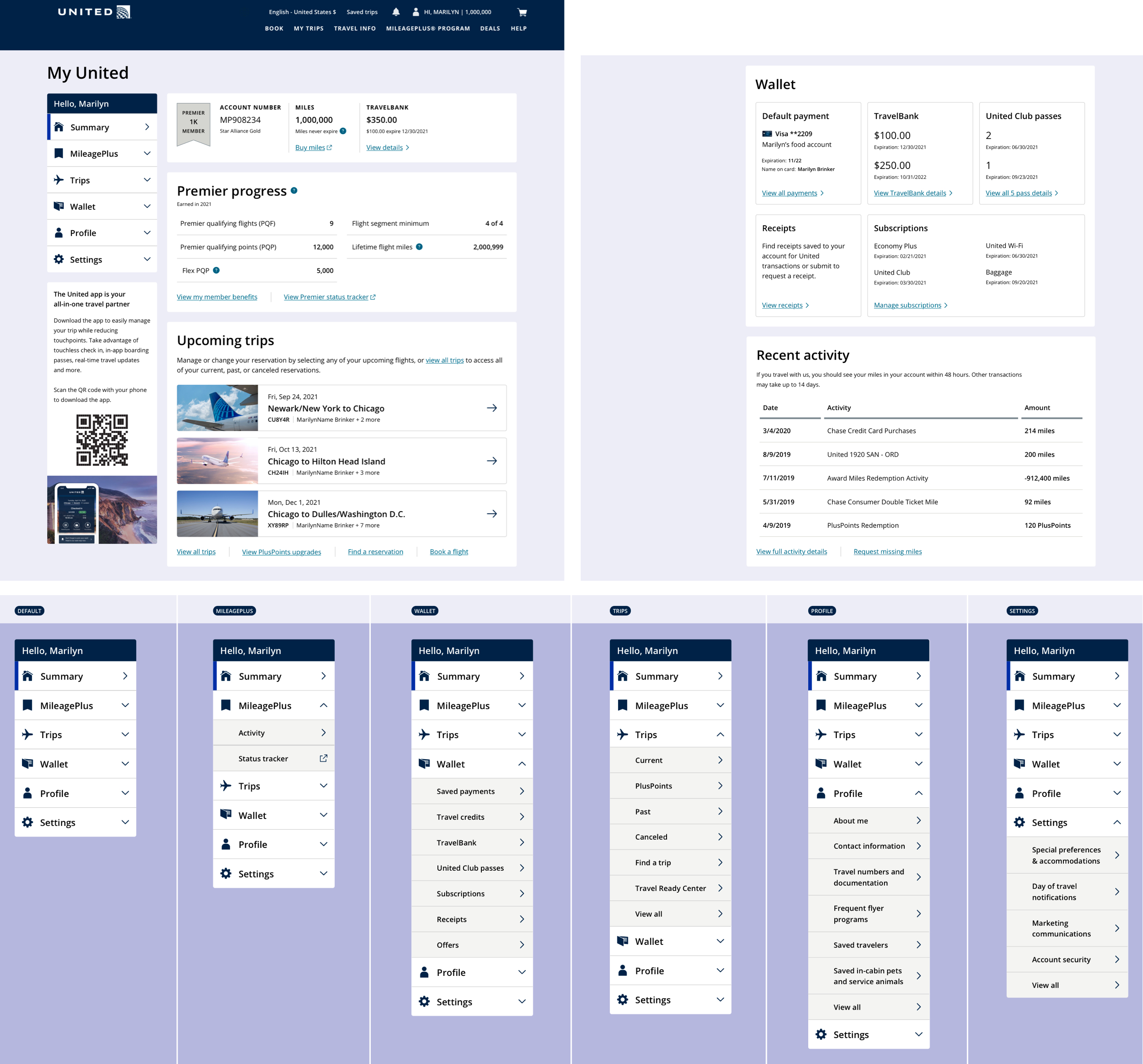
Information Architecture
The aim was to integrate existing My Account pages into a more intuitive navigation system while introducing new elements, such as Wallet, seamlessly.
Competitive Analysis
I evaluated the offerings of 9 competitors, identifying some broad trends:
• Side-bar navigation: Predominantly used for extensive subsections, followed by horizontal navigation with tab structures at the second level.
• Modular design: Those employing a modular approach facilitated easier scanning of content.
• Snapshot views and prioritization: Key details were presented first and prominently on the account pages. Some sites used their landing page as a summary screen, providing an at-a-glance overview for users.
Ideation and Design Implementation
Drawing from my analysis, I created several design iterations, refining a general layout following feedback from peers and leaders.
I emphasized a modular system to highlight important information and offer multiple routes for users to reach their endpoint, depending on their preference for scanning summary information or using a side-navigation bar for detailed exploration.
Desktop
Mobile

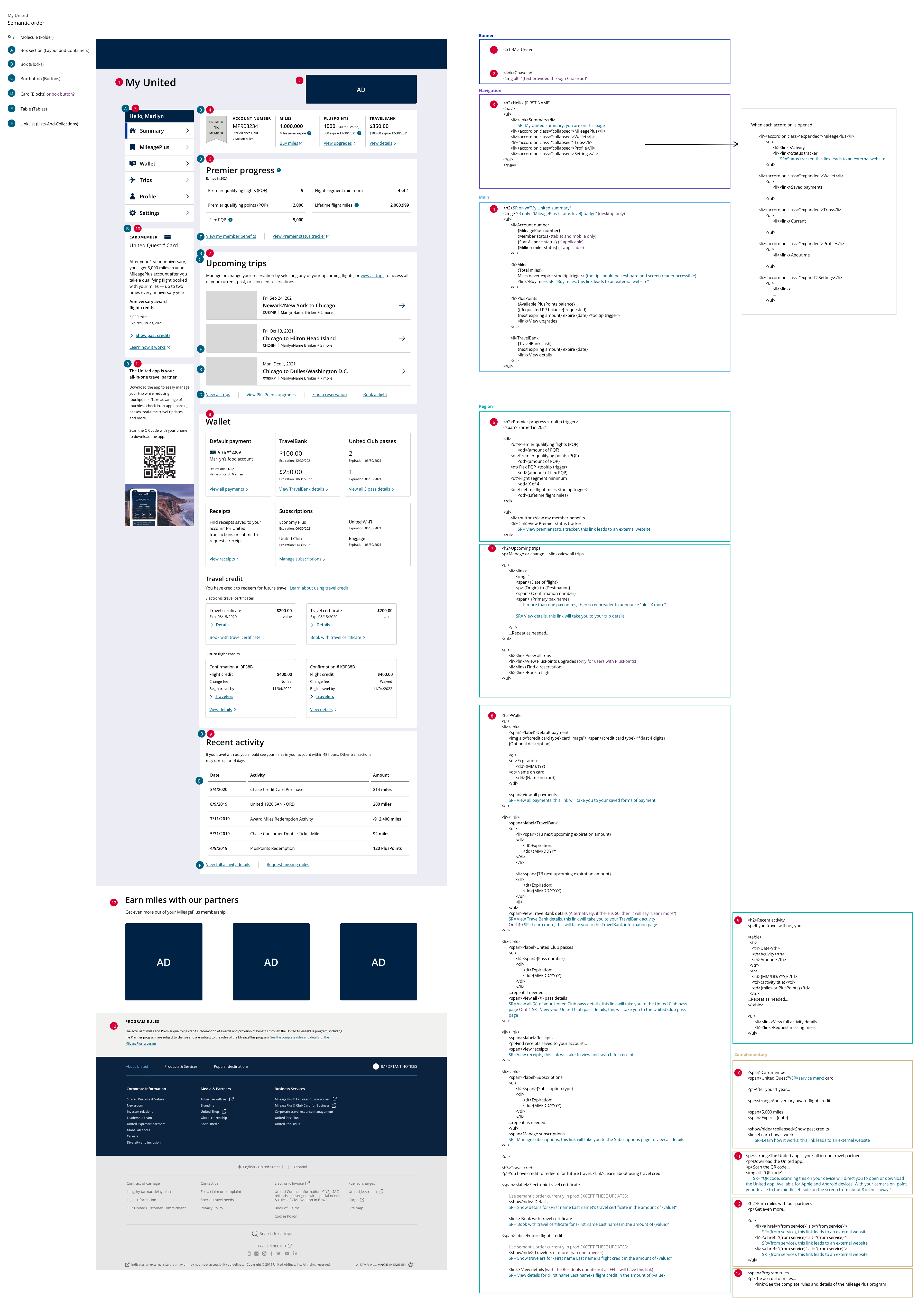
Ensuring Accessibility
In alignment with United's WCAG AA guidelines, all designs underwent a thorough color contrast check. I worked hand-in-hand with our UAT specialist to ensure the experience was inclusive for all users, including a detailed semantic order for developers to ensure seamless screenreader messages and tabbing structure.
Usability Testing
I built a prototype in InVision featuring high-fidelity designs for unmoderated usability testing. My central research questions included:
What are customers' expectations around My United?
How are customers navigating the page?
Eighteen participants, a mix of non-members, general members, and premier members, participated in this diary study conducted using UserTesting.com. I reviewed each video, documented interactions, and summarized them into a spreadsheet for sentiment comparison.
Results
The feedback was encouragingly positive from all 18 participants, and the updated design resonated well. For privacy reasons, more detailed results and participant quotes can be shared in a 1:1 conversation.
Refinement and Delivery
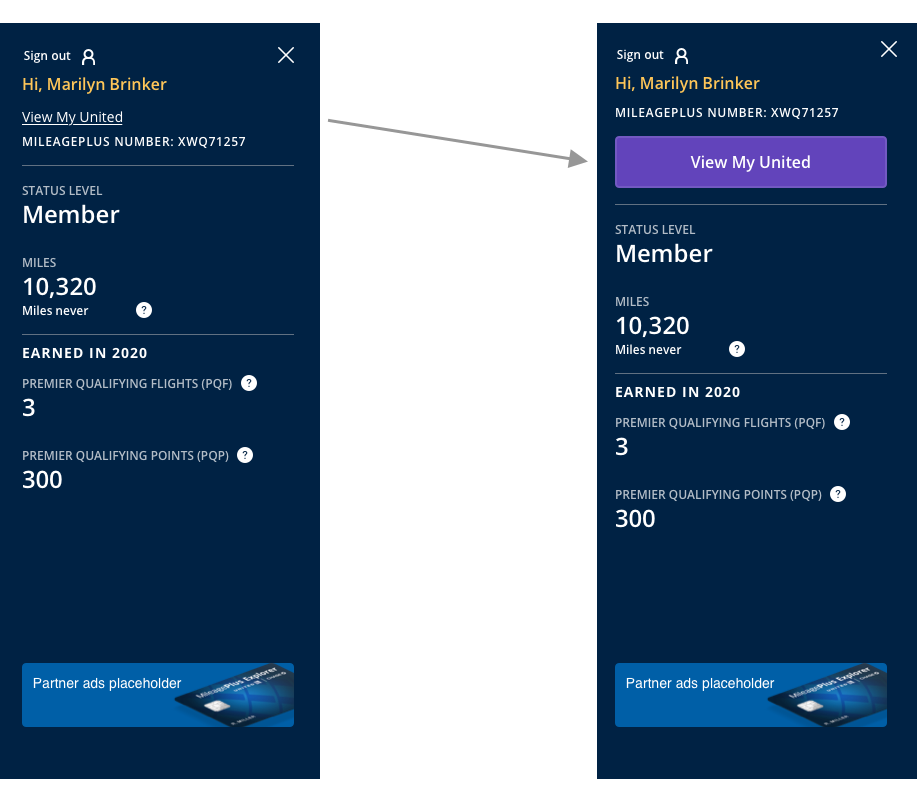
Based on user testing feedback, the following updates were implemented before delivery:
• Access point: An underlined link call-to-action was initially in place, but it was often overlooked by users in the diary study. To address this, we replaced it with a larger, more noticeable call-to-action button.
Refinement and Delivery
• Navigation bar: Wallet was initially listed above Trips in the navigation bar. Based on participant feedback emphasizing the importance of Trips, we reordered these for user convenience.
After establishing the initial MVP design, I coordinated with the product team to devise a phased delivery approach. I worked closely with our Dev and QA teams throughout the development process. The first phase was launched on November 17th, with more enhancements planned in future phases.
Conclusion
Initial user sentiment, gathered through our active feedback pop-up form, has been stable. Feedback has also helped us identify additional improvements, with more user data and insights expected soon.