//
research
Overview
In the digital age, user experience determines the success of many online platforms. As part of our commitment to enhancing user satisfaction, we embarked on a journey to redesign the "My Account" section, aiming to create a seamless and stress-free experience for our users.
Project Duration
6 weeks with ongoing improvements
My Role
Lead UX Designer and Researcher
Platform
Responsive Web & Mobile App
Tools Utilized
Pen, paper, Sketch, Zeplin, InVision, UserTesting, Quantum Metric, Microsoft Teams

Problem Statement
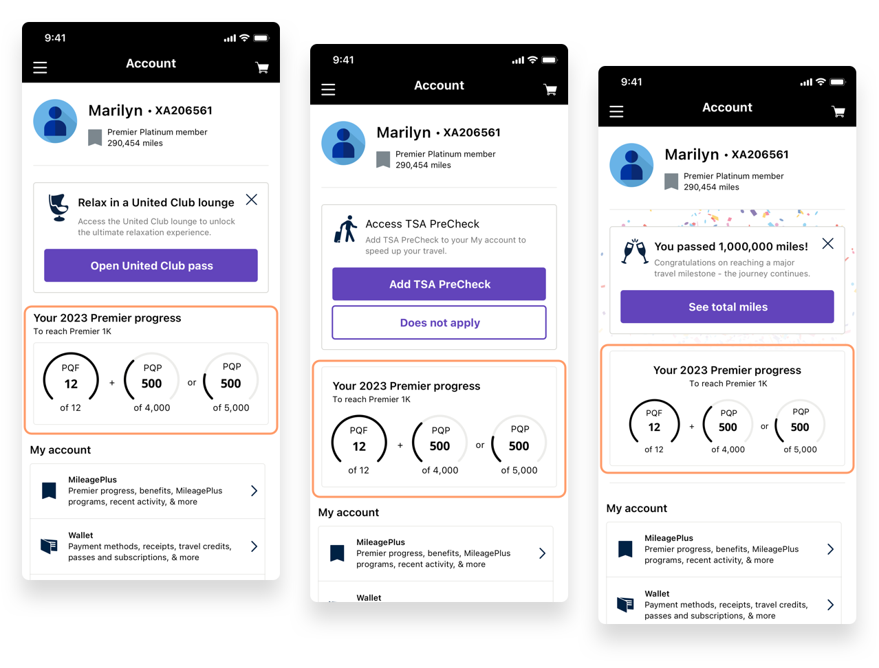
Feedback from users indicated difficulty in locating content within the "My Account" section, lack of motivation to provide more information, and no distinct incentive to remain loyal to United.
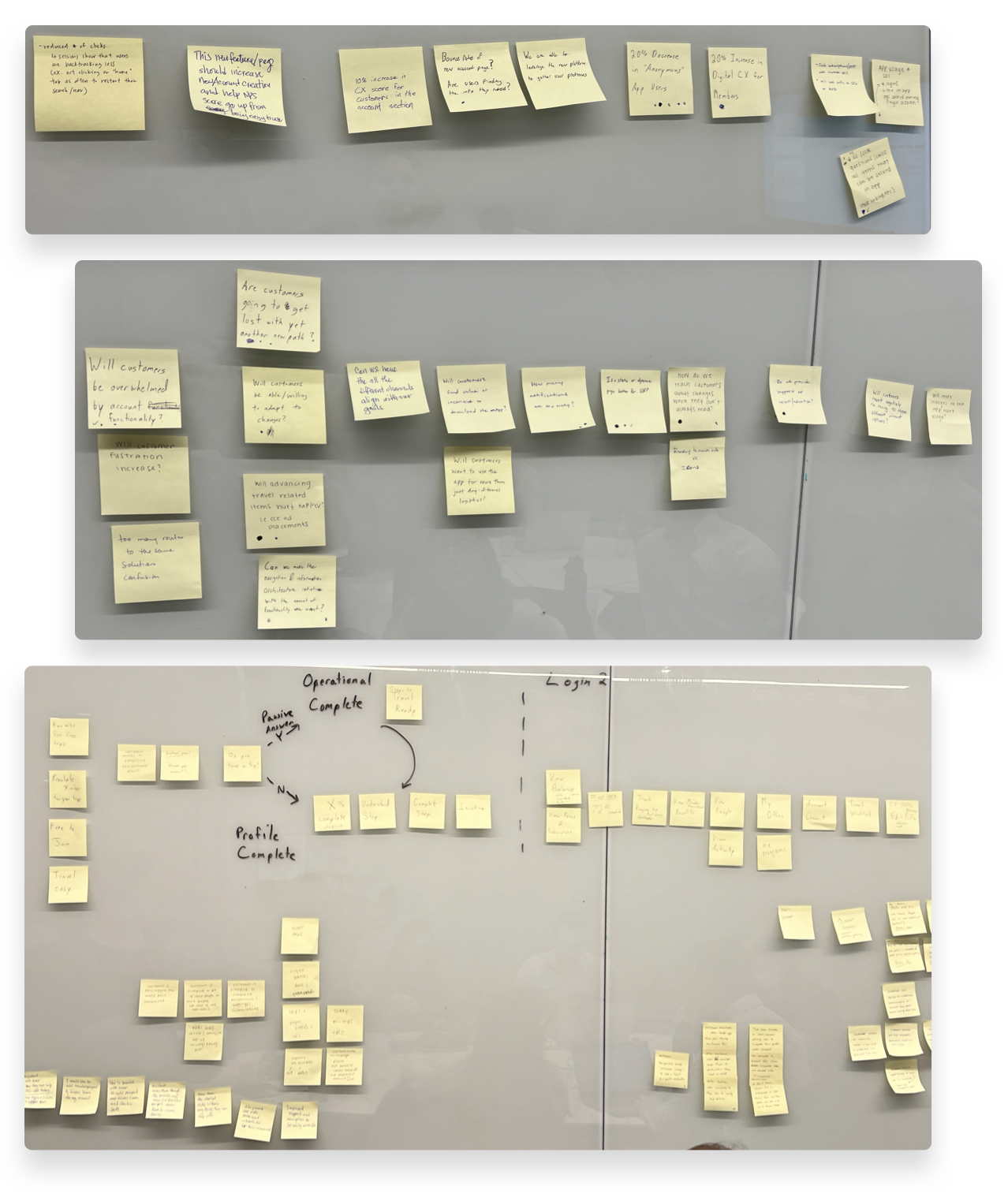
Goals
Key questions
Risks
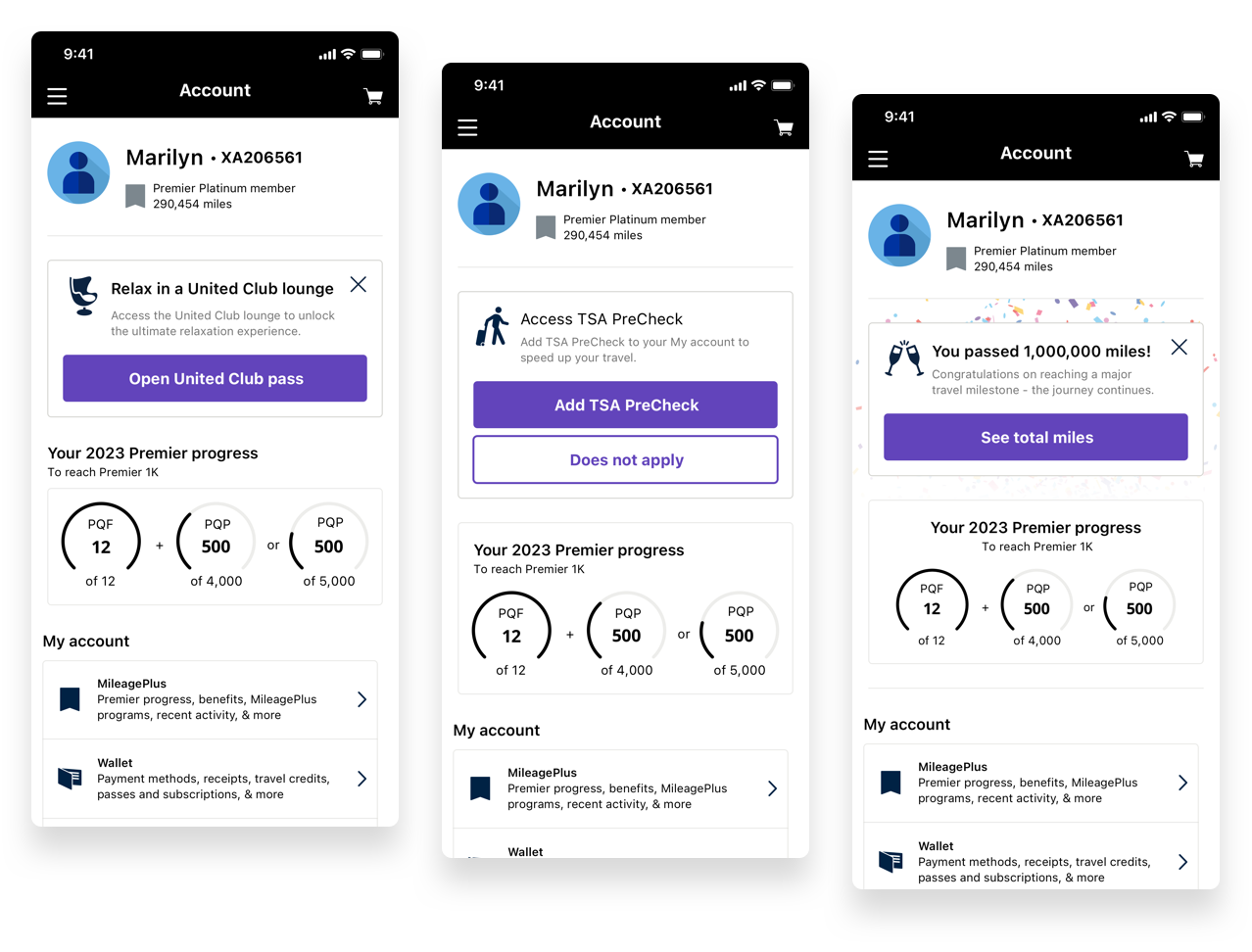
Solutioning
Based on feedback and a deep dive into current trends and successful UX patterns, we devised the following solutions:

User testing plan
With a diverse group of 8 participants, spanning ages 19-64 from the U.S. and having traveled with United at least once the previous year, we sought to gauge the intuitiveness and appeal of our redesign. Their feedback would be crucial in identifying the strengths and weaknesses of the new "My Account" design.
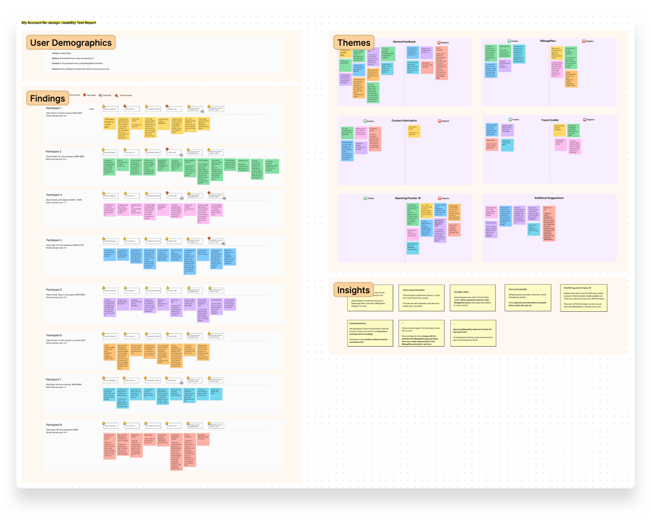
User Testing Results
Key insights from our tests included:
Overall, the feedback was positive, but suggestions for improvements were noted, especially in the representation of MileagePlus status and the clarity of some menu items.
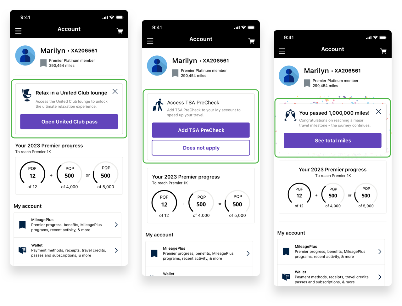

Conclusion
The redesign of the “My Account” section is a testament to our dedication to our users. While the results from the initial user testing are promising, there are areas to improve upon, particularly in the representation of the Premier Status Card. As we continue to evolve this experience, user feedback remains integral.
Next Steps: